Up and Over Trio
Album Design
Design Study

Mockup
2021
Spread
2021
About
As of 2018, all students enrolled in Typography I receive a project brief, and liner notes. BRR team and the artists involved in the current two albums this year (Chandelle Rimmer & Tom Van Seters / Up and Over Trio) will visit the class to discuss the album with the students. The students will have then an opportunity to ask questions about the music, style and tone of the work, and discuss the overall conceptual and creative approaches that will be considered (Constanza Pacher - Bachelor of Design - MacEwan University - Fall 2021)
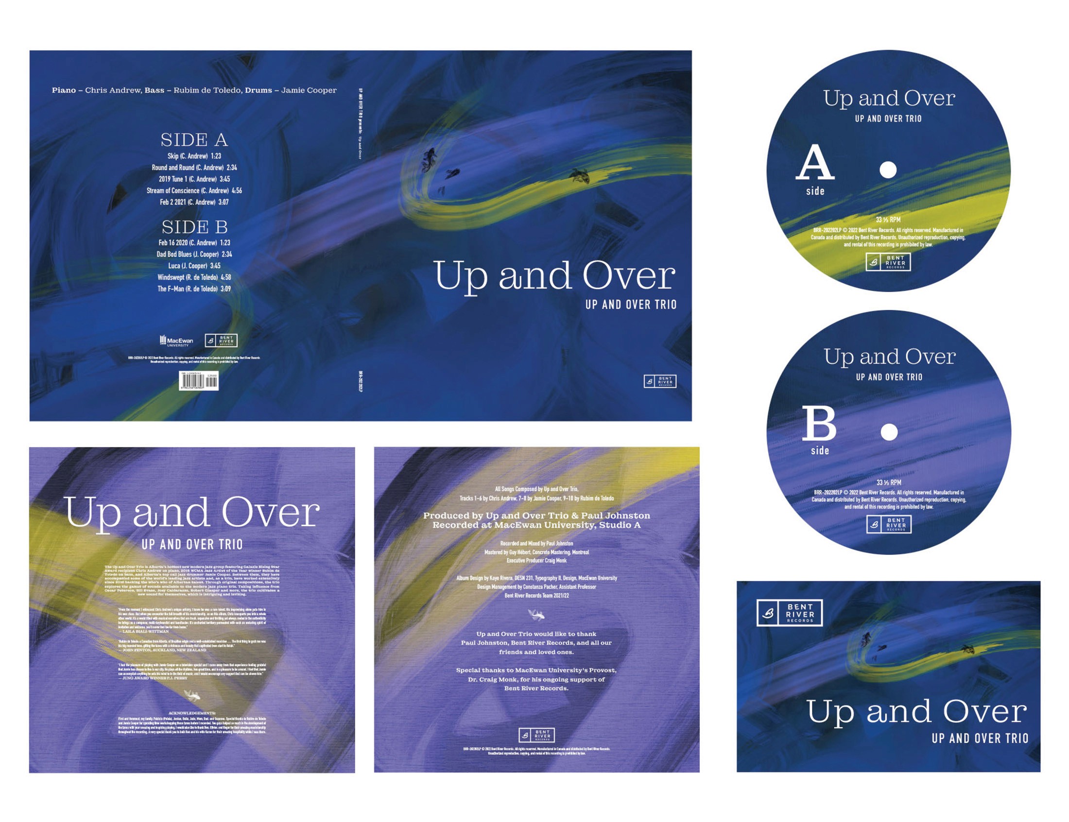
Inspired by how emotion influences the listener’s interpretation of the Up and Over Trio’s music, the viewer’s current emotion evokes the impression of the cover jacket and overall album package.
On the jacket, the strokes of paint are specific and purposeful, considerate in not influencing the viewer’s perception. The strokes of pops of color are minimal; up for interpretation. At the same time, they are free, representing the Trio’s creativity and fluidity in their music.
The three koi fish represent the trio, each coming from their own respective journies of creativity, coming together to create a new stroke of paint in their canvas. Koi fish are featured in this cover instead of people. While people consist of rough rectangular shapes, koi fish hold organic shapes and delicate features that are in tune with the flow of the paint, revisiting the concept of the Trio’s creativity and fluidity.
While the cover holds many cool tones, the serif typeface in the title brings a sense of warmth to the jacket. Although most serifs can be boxy and ridged, the serif chosen is delicate, containing thin lines and round features. The title’s typeface is paired with a neutral sans-serif typeface to highlight the title’s delicacy.
As the insert is drawn from the jacket, the light purple is revealed behind the cover’s cool blue, providing a bold contrast. Minimal pops of color on the insert allow the viewer to focus on the information and learn more about the Trio and their music.
Each piece of the album includes at least two colors from the cover to provide more for interpretation as each piece is viewed. The repetition in colors also presents cohesiveness throughout the package. Together, the system’s mood is interpreted by the current emotion of the viewer, similar to how the listener interprets the Up and Over Trio’s music based on their present emotion.